
Econo Foods' customer base is remarkably diverse. The brand doesn't belong to one community — it belongs to many, across regions and demographics, united by everyday value. That pointed us in a clear direction.
Their customers are also ready to be spoken to directly. Not through soft, hedging marketing language — but with the same confidence and colour the products themselves carry. The design had to be bold, product-forward, and honest. Something that earns attention rather than asks for it.
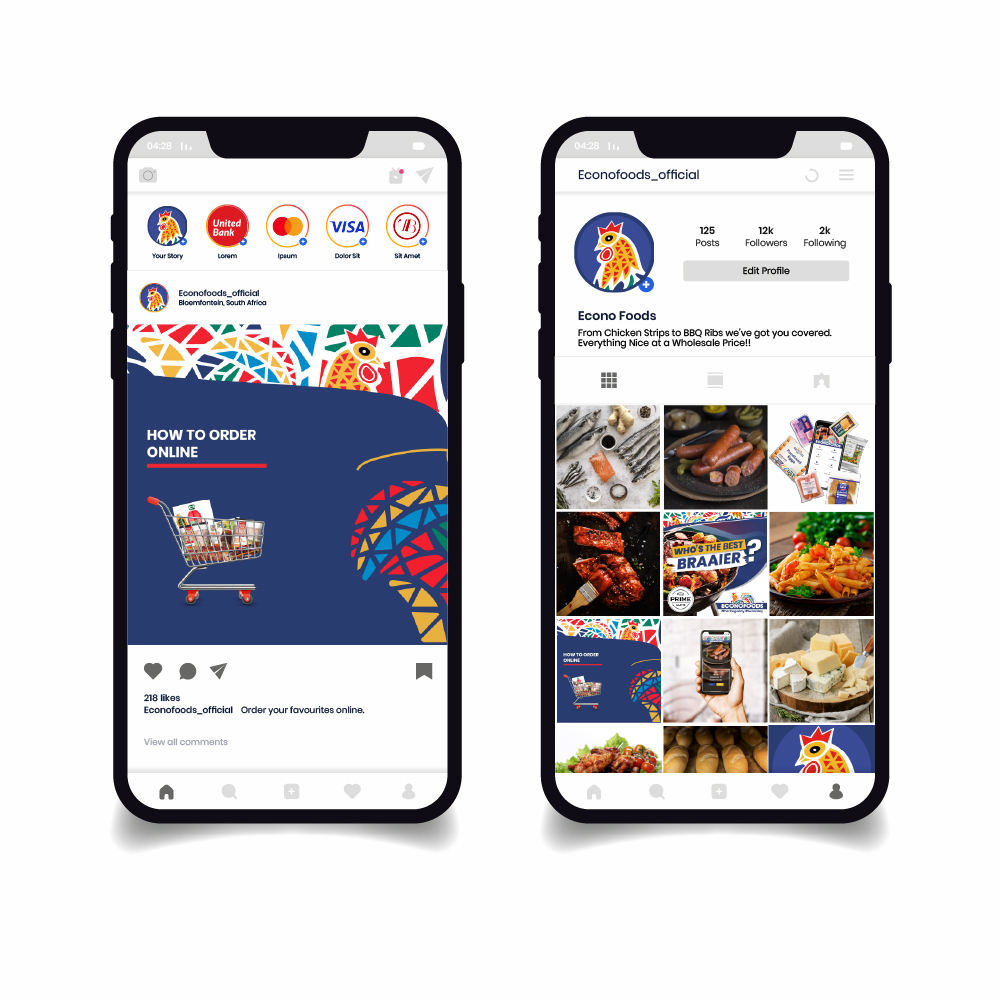
We started with what Econo Foods actually does well: give people access to quality goods at honest prices. The creative built outward from that truth. Bold colour, confident typography, and product imagery that doesn't need a filter. The poster was designed to stand tall in-store and on-screen. The Instagram carousel took customers through the online ordering experience — step by step, with the same directness.
Sale poster — designed for in-store and digital placement
The carousel walked Econo Foods' audience through their online ordering platform in three steps — browse, pay, receive. Each pair of slides handled one stage, keeping the message focused and the visual momentum strong from first frame to last.
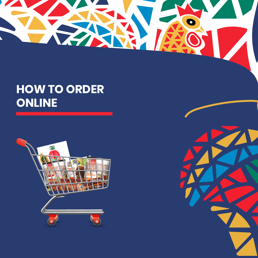

Visit shop.econofoods.co.za or download the app to get started
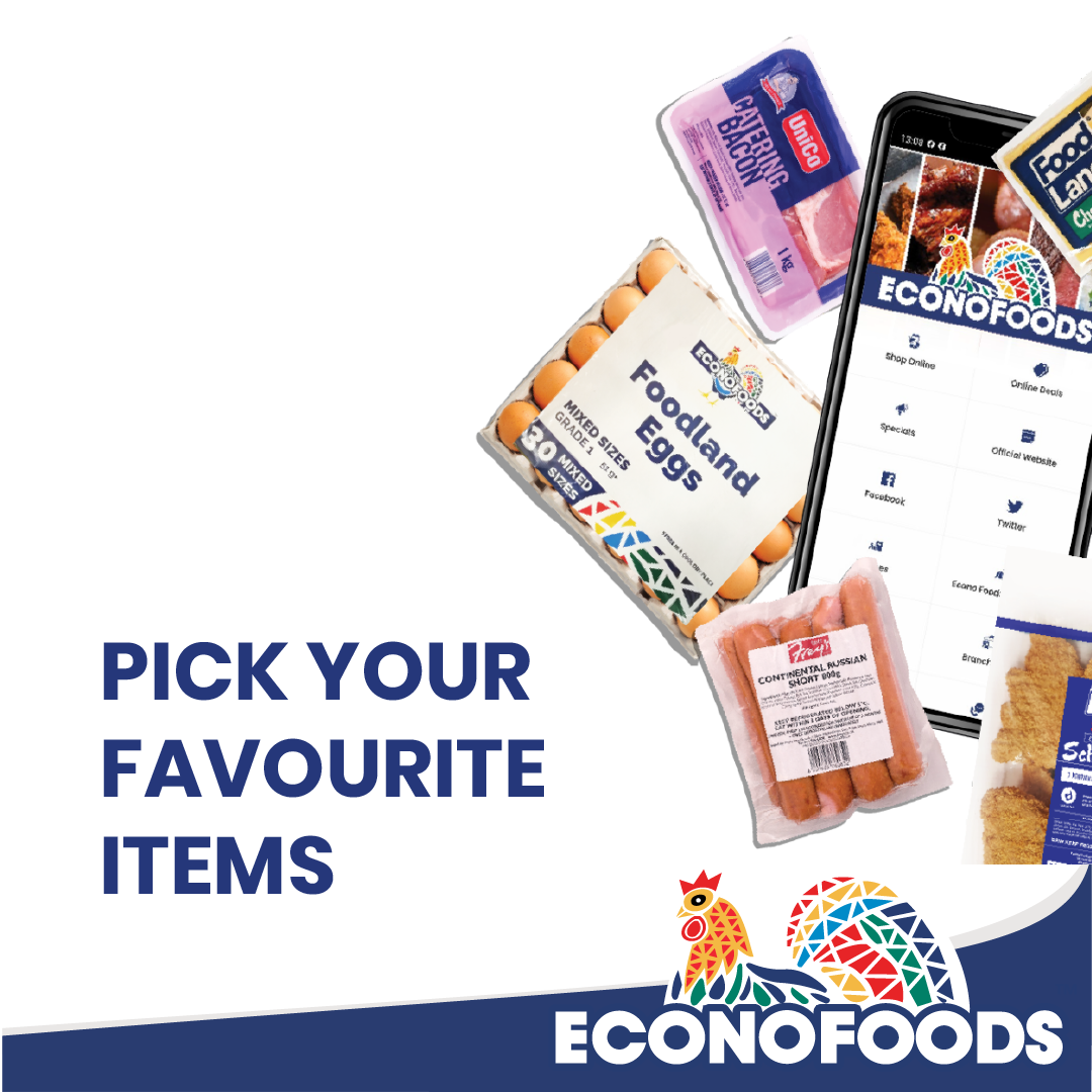
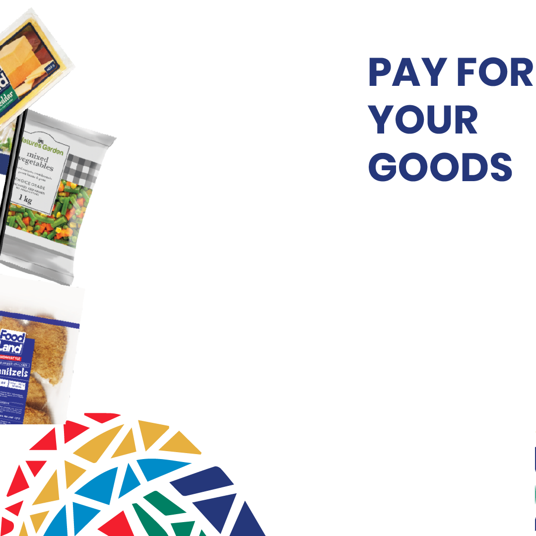
Browse the full range, pick your favourites, and pay securely in-app
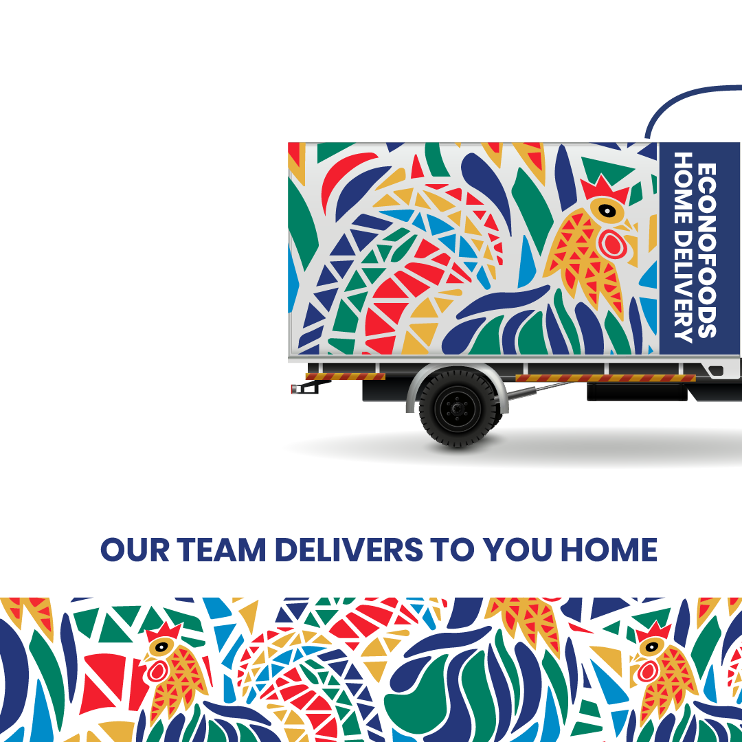
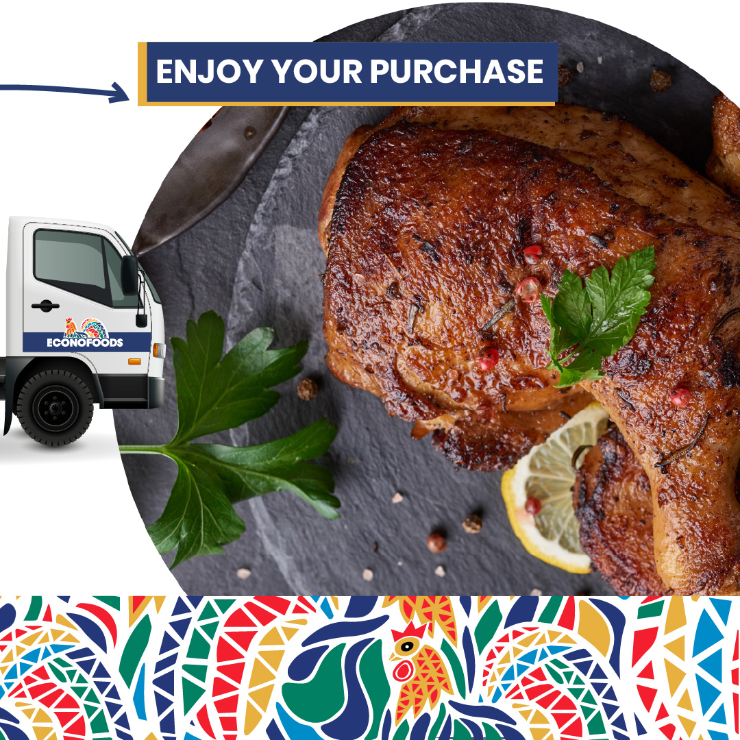
Delivered to your door — then it's over to you
"Design that reflects who you are,
not just what you sell."
Portfolio Creative — Econo Foods, 2022