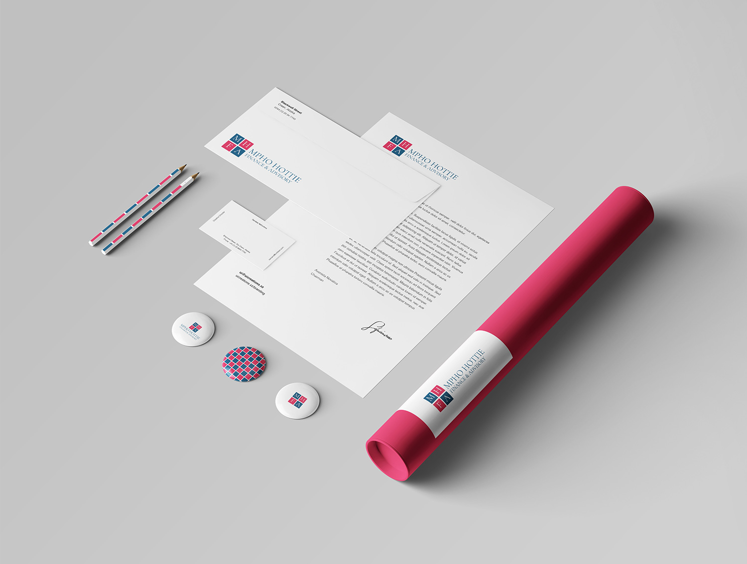
In crafting MHFA's brand identity, we embarked on a quest to mirror the essence of trust and expertise. Our approach was simple yet strategic, focusing on elements that convey reliability and assurance.
Color Palette: With red, blue, and white as our guiding hues, we aimed to embody professionalism and stability. Red for passion and strength, blue for trust and competence, and white for purity and clarity.
Logo Design: Our logo features a solid group of four squares, reminiscent of a chessboard. This geometric motif speaks to strategic thinking and the interconnectedness of financial elements. The white lines between the squares symbolize precision and attention to detail.
Typography: We opted for a classic serif font for the logotype, exuding tradition and professionalism. Its elegant curves and confident strokes align perfectly with MHFA's commitment to excellence.

