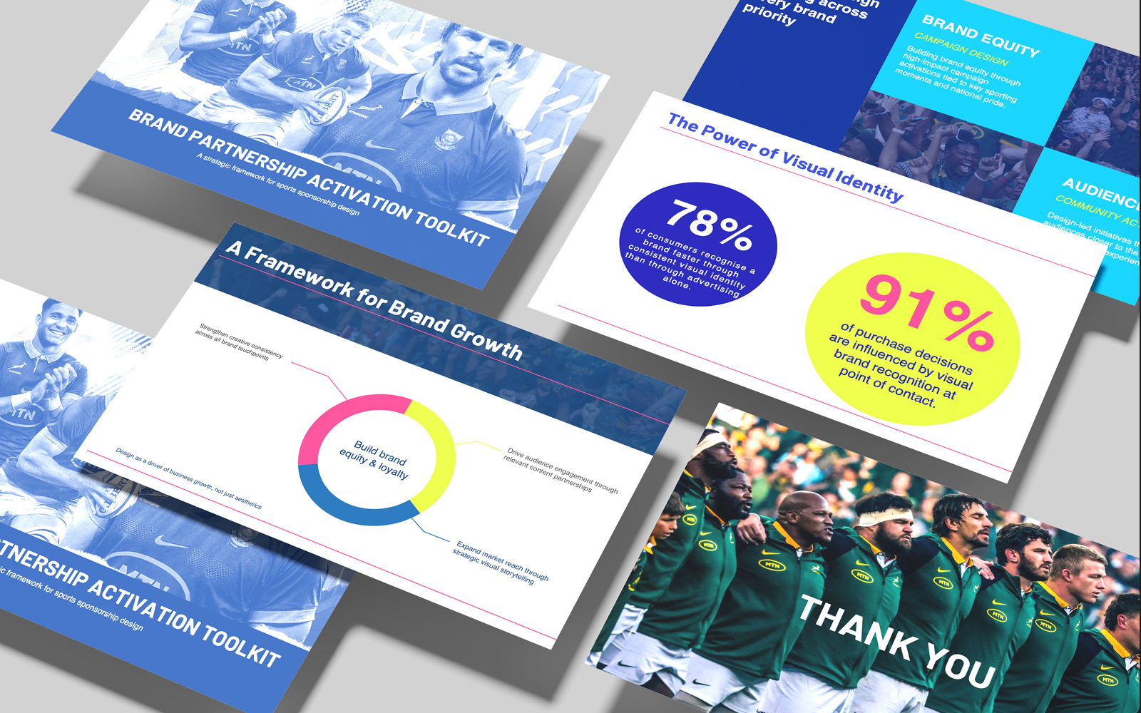
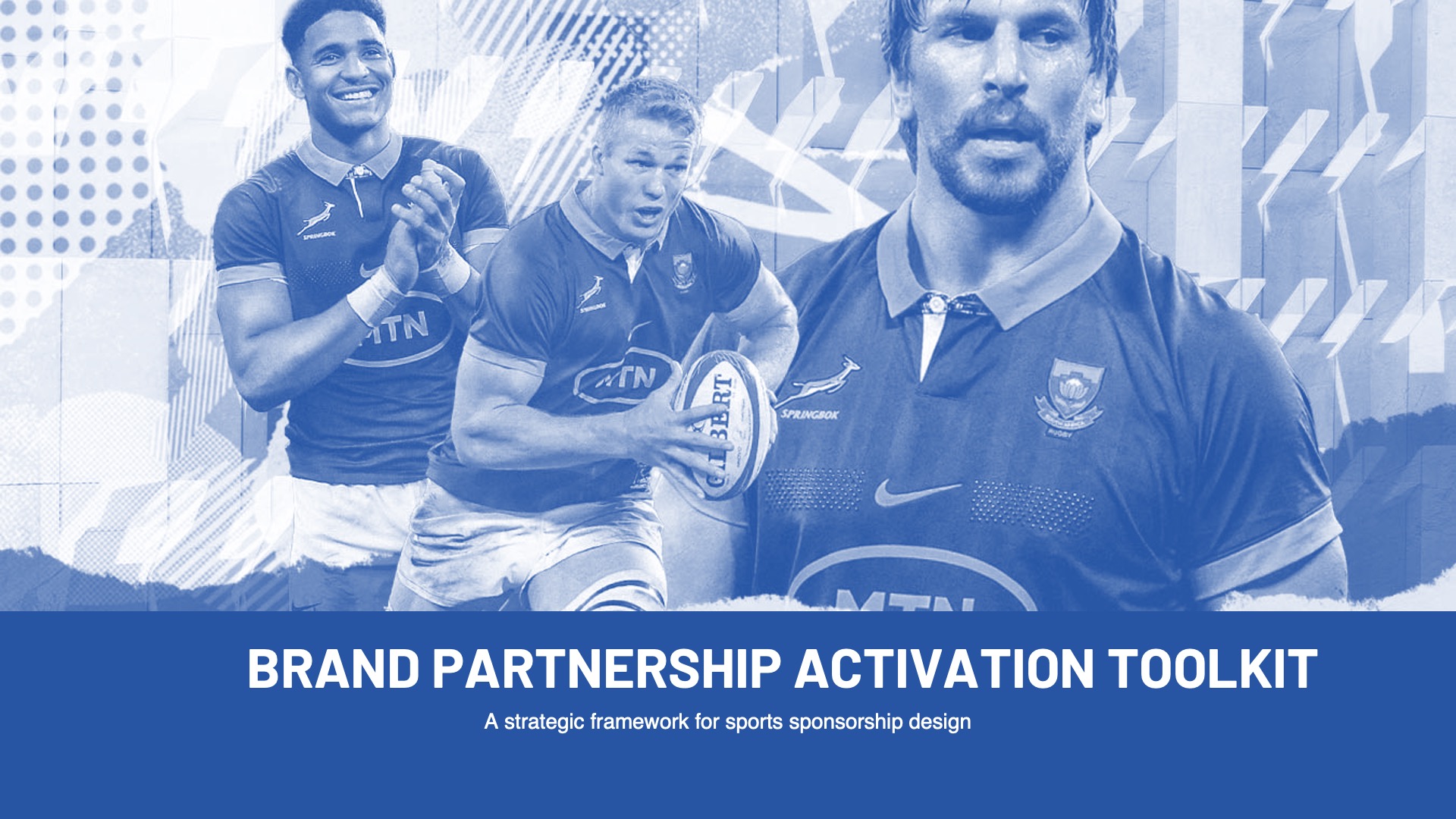
01 — Cover
The cover sets the tone before a word is read — duotone imagery, bold typography, and a visual language that signals sport without overstating it.
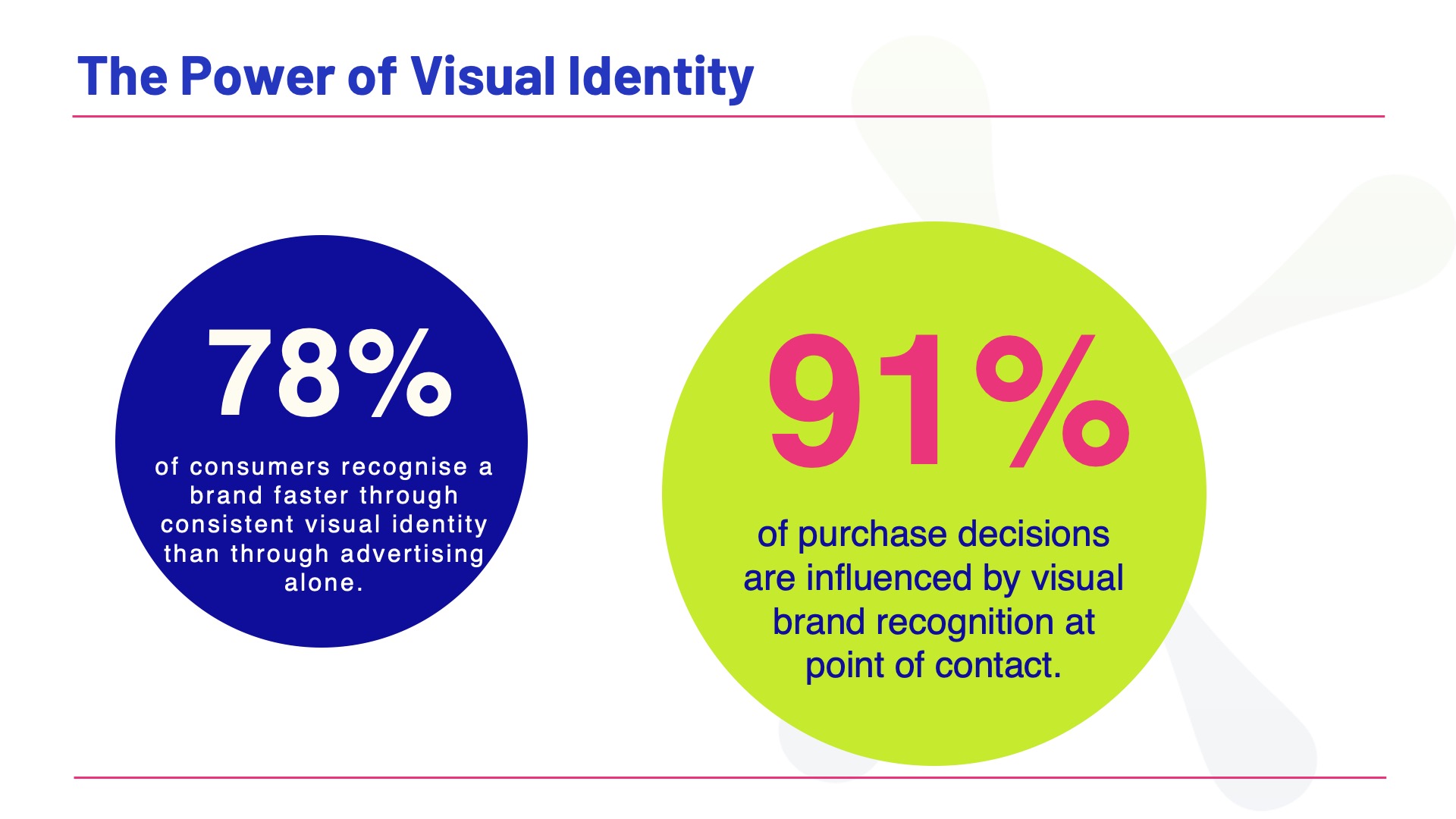
02 — The Power of Visual Identity
Data visualised with intention — two statistics that make the strategic case before the strategy is even presented. Numbers only work when the design makes you stop and read them.
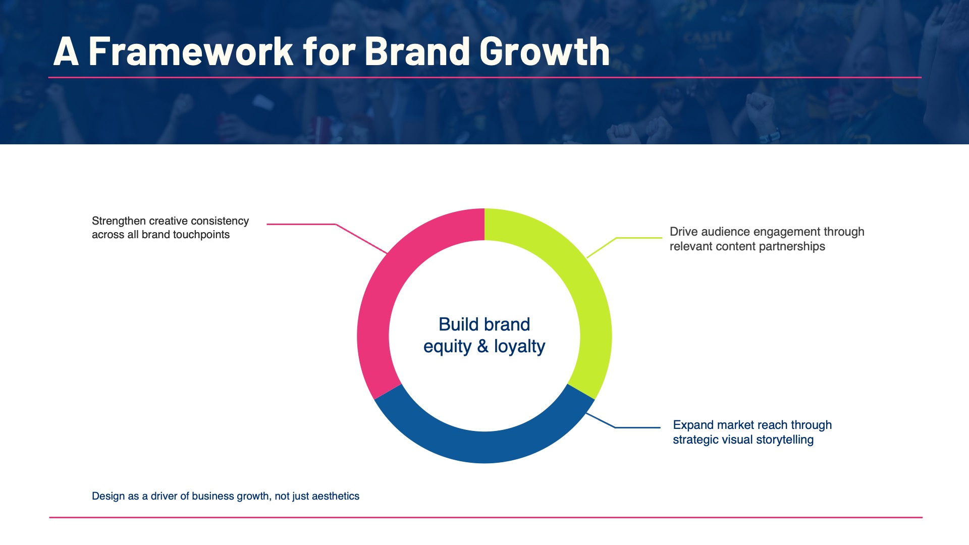
03 — A Framework for Brand Growth
A multi-part strategy expressed as a single visual — each segment weighted equally, the whole greater than its parts. The goal was clarity, not decoration.
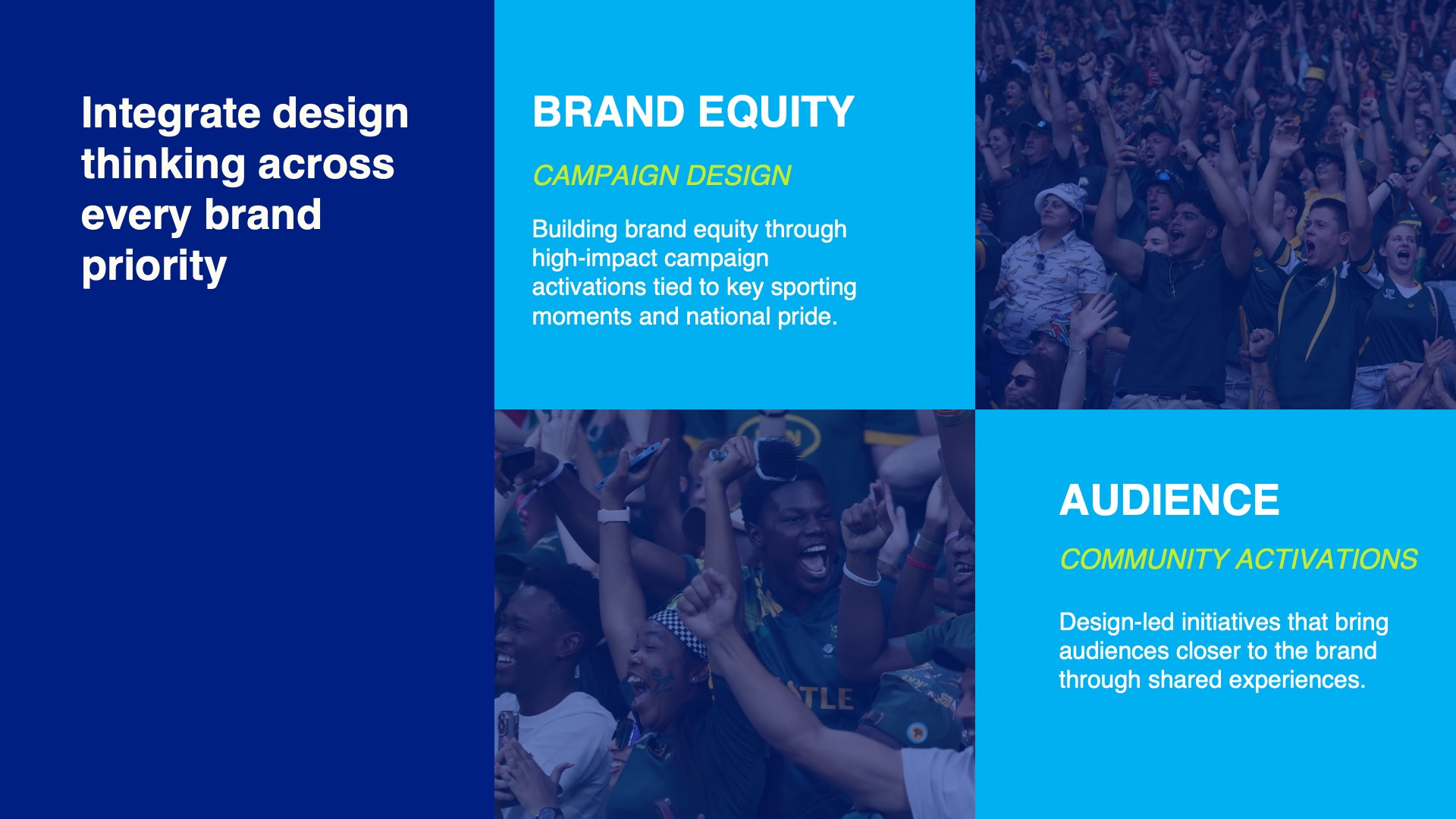
04 — Design Thinking Across Brand Priorities
Brand equity and audience activation laid out in a grid that's scannable in seconds. In a boardroom, clarity is a competitive advantage.
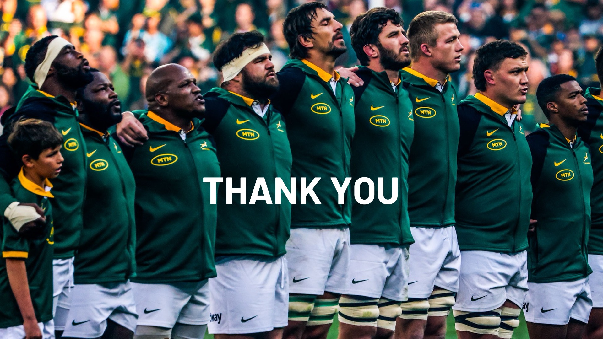
05 — Close
The close. A full-bleed image that lets the emotion of the partnership land without words getting in the way — because the best endings don't need explaining.