Brand Guidelines · 2026.01
Portfolio Creative · Studio

Brand
guidelines
for every team.

The single reference for how Portfolio Creative looks, sounds, and shows up — across decks, websites, social, print, and partner communications.

Issued
May 2026
Custodian
Design · Brand Studio
Sections
18
A reference, not a rulebook
Contents

What's in here.

i. Foundations
  1. 03Brand essenceVision · Mission · Values
  2. 04Voice & toneHow we sound
  3. 05Logo systemLockups + variants
  4. 06Logo · clear spaceProtection & minimums
  5. 07Logo · misuseDon't
ii. Visual language
  1. 08Colour · brand paletteTurquoise + purple
  2. 09Colour · neutrals & semanticScale + status
iii. Type & texture
  1. 10Typography · PoppinsOperational
  2. 11Typography · Cormorant InfantEditorial
  3. 12Type scale & rhythmEyebrow · Heading · Lead
  4. 13PatternThe geometric weave
iv. Imagery, components, application
  1. 14PhotographyTone & treatment
  2. 15IllustrationPurple + line library
  3. 16Iconography & componentsLucide + buttons
  4. 17Layout & motionGrid, spacing, states
  5. 18Sign-off & contactOwners & versions
i. Foundations · The brand, in one breath

Building brands.
Building relationships.

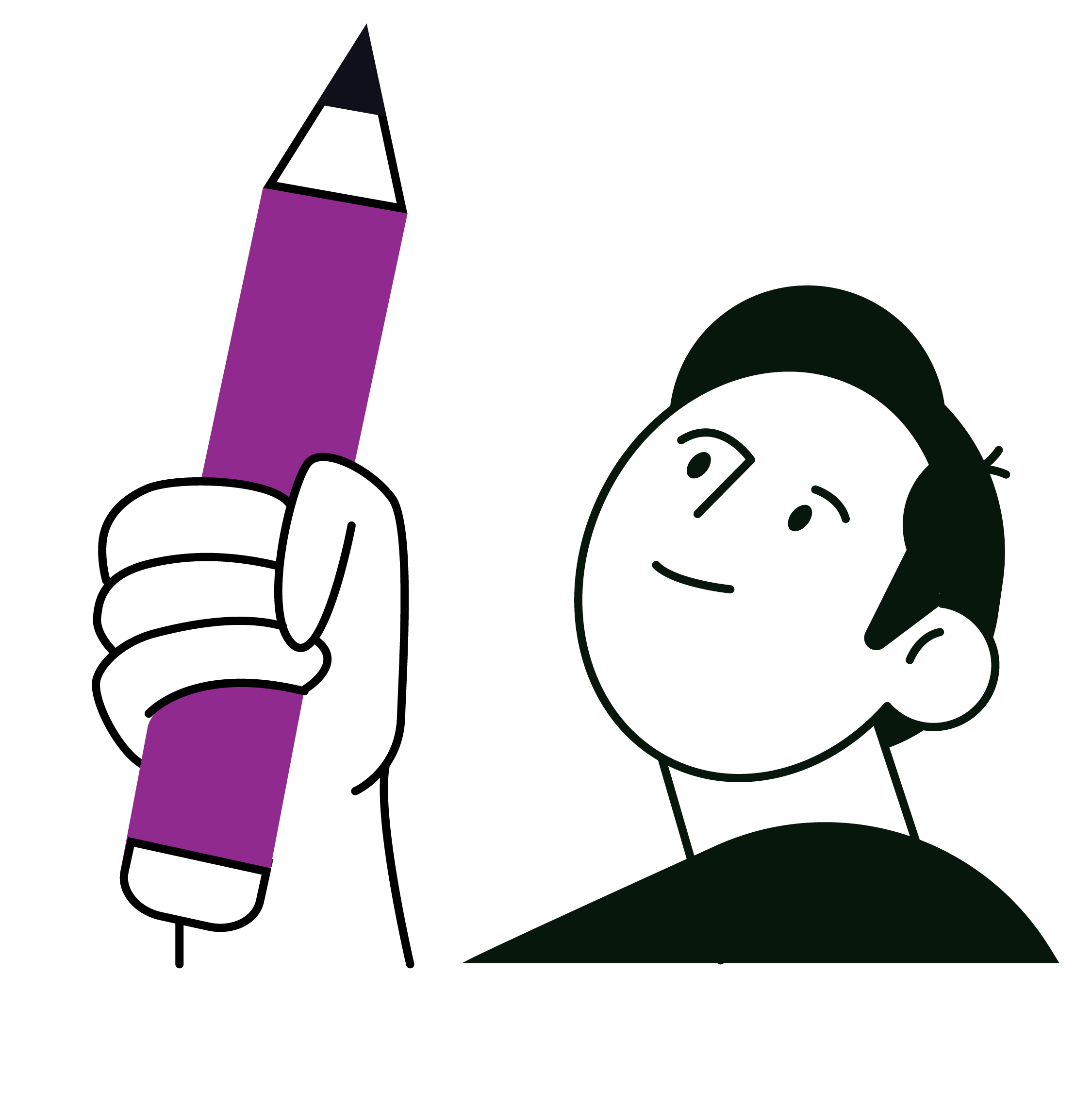
Portfolio Creative is a multidisciplinary studio — design, strategy, digital, audio. For over a decade we've hand-crafted brands for small and large businesses across South Africa and the globe. We work as an extension of your team, not a vendor.

Vision
To create a bright future full of brands that want to excel in their industries.
Mission
To create exciting, industry-leading brands — and help people understand that every part of the brand system matters.
Values
· Consistency
· Trustworthiness
· Relevance
· Adaptability
Pillars
· Creativity
· Collaboration
· Quality

Design · Strategy · Digital · Audio
i. Foundations · How we sound

Professional but approachable.
Confident but never arrogant.

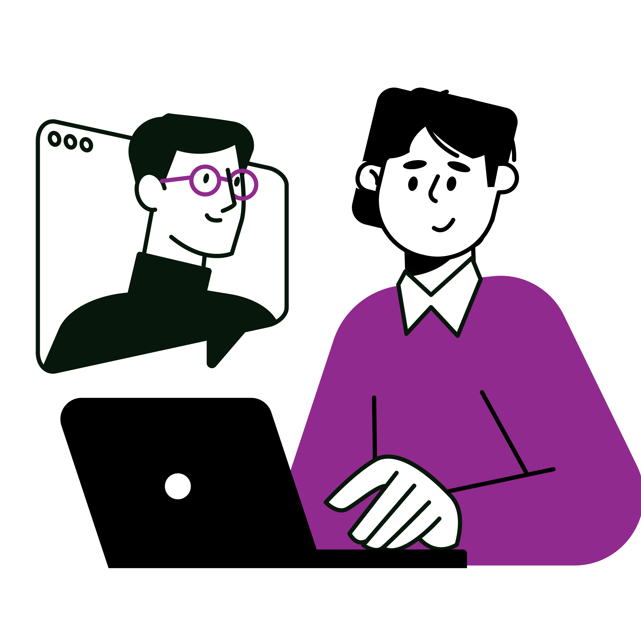
We write as a partner, not a vendor. Sentence case. First-person plural — we, our. Second-person to the client. Em dashes are welcomed — they carry the brand's rhythm.

Tone dial
Lean intoLean away from
Clear, simple sentencesJargon, buzzwords, agency-speak
First-person plural — we, ourI, or impersonal third person
Second-person to the clientCalling clients 'customers' or 'users'
Verbs of partnership — build, supportVerbs of sale — deliver, leverage
Slight wit when it fitsSarcasm or irony
Confidence with proofSelf-aggrandising claims
Casing & punctuation
Sentence case
About us · Our process · Get in touch
Default for UI, body, captions, most headings.
Title Case
Portfolio Creative
Reserved for proper nouns and the full brand name.
All caps
OUR PROCESS · CASE STUDY
Eyebrows only — 11–12 px, +0.18em tracking.
In the wild
Hero
Building brands. Building relationships.
We help brands find clarity, build stronger systems, and communicate with purpose.
CTA
Let's talk →not "Get a quote!"
Proposal closing
Thank you for the opportunity. If anything in this document needs to flex, it can — the work is a partnership, and the plan should reflect that.
i. Foundations · The logo system

Five lockups. One identity.

The brandmark, wordmark and combined lockups work as a family. Reach for the variant that fits the space — never construct your own.

Primary logo
Primary · A1 — Horizontal lockup (full colour)
The default. Use everywhere unless the surface demands another variant.
Stacked logo
A2 · Stacked
Square crops, narrow columns
Brandmark
A3 · Brandmark
Favicon, social avatar, app icon
Wordmark
A4 · Wordmark
Tight horizontal spaces; tertiary use
White logo
A5 · Reversed
For dark backgrounds & photography
i. Foundations · Protection & minimums

Give the mark room to breathe.

Clear space · X = height of the brandmark
logo
X
X
X
X

The minimum clear space on every side equals the height of the brandmark. No text, icon, image edge, or competing logo may enter this zone.

Minimum sizes
Print · 28 mm wide
Horizontal lockup, full colour or reversed
Digital · 120 px wide
Screens at 1× and 2× density
mark
Brandmark only · 16 px
Favicon, app icon, social avatar
Rule of thumb
If the tagline feels uncomfortable to read, the logo is too small — step up a size or switch to the brandmark.
i. Foundations · Don't

The shortest list of all:
what we never do to the mark.

Don't stretch
Scale uniformly only
Don't recolour
Brand palette only
Don't rotate
Keep on the baseline
Don't add shadow
No bevel, glow or 3D
Don't outline
No strokes, no extras
Don't use unapproved gradients
Only two approved PC gradients permitted
Don't tint or fade
Full contrast, always
PORTFOLIO
CREATIVE
Don't recompose
Use approved lockups
i. Foundations · Logo placement

Right logo. Right surface.
Every time.

The logo may only appear on approved backgrounds. Each approved surface has a designated logo version. Never place the logo on a background that has not been approved below.

Approved backgrounds & correct logo version
Full colour logo
White or light grey
Full colour logo · always approved
White logo
Moody Turquoise
White logo only
White logo
Creative Purple
White logo only
White logo
Black / Deep charcoal
White logo only
White logo
Approved gradient — Teal → Charcoal
White logo · this gradient only
White logo
Approved gradient — Purple → Charcoal
White logo · this gradient only
The gradient rule
Only the two PC gradients above are approved for logo placement — Teal→Charcoal and Purple→Charcoal. No other gradient may carry the logo. Always use the white logo version on any gradient.
Correct rule
One logo version per background. White on dark, teal, purple, or approved gradient. Full colour on white or light grey only. Never invent a new combination.
Never place the logo on
Photography, patterned backgrounds, unapproved gradients, colours outside the brand palette, or any surface where contrast drops below AA accessibility.
i. Foundations · Co-branding

Partnership lockups.
Side by side — never merged.

When Portfolio Creative appears alongside a partner brand, both identities must remain visually separate and equal. Never combine, overlap, or visually merge the two marks.

Approved lockup structure
PC Logo
Light background
Full colour PC logo · Vertical rule · Partner logo at equal visual weight
PC Logo white
Dark background
White PC logo · 20% white rule · Partner logo in white or reversed version
Rules
  • ·PC logo always appears on the left
  • ·Separate marks with a 1 px vertical rule
  • ·Both logos at equal optical height and visual weight
  • ·Minimum clear space of X applies to both marks independently
  • ·Use the correct logo version for the background (see logo placement)
Never
  • ·Let partner brand colours override PC background rules
  • ·Overlap, merge, or nest the two logos
  • ·Place both logos without the divider rule
  • ·Make the partner logo significantly larger than the PC logo
  • ·Use in production without written sign-off from the brand custodian
Before you use a partnership lockup
All co-branded applications require approval from the Portfolio Creative brand custodian. Send the proposed lockup to brand@portfoliocreative.co.za before printing, publishing, or sharing externally.
ii. Visual language · Colour · brand palette

Two colours, one philosophy:
signal, not coating.

Turquoise and purple sit at exact complementary hues. Use them as flat fields, separated by white space — never gradients, never overlapped.

Primary
Moody turquoise
Self-expression and artistic liberty. The brand's loudest voice — used for buttons, links, eyebrows, the pattern.
HEX
#2A8E92
RGB
42 · 142 · 146
CMYK
71 · 18 · 38 · 26
PMS
7715 C
tint#E5F1F1
base#2A8E92
hover#237D81
deep#1B6F72
Accent
Creative purple
Creativity and unconventional thinking. Used sparingly — editorial moments, illustrations, decorative numerals.
HEX
#922A8E
RGB
146 · 42 · 142
CMYK
38 · 90 · 0 · 0
PMS
2415 C
tint#F2E2F1
base#922A8E
hover#7E1F7A
deep#6F1C6C
Recommended proportion
70% White
22%
8%
Do
Flat fields, separated by generous white space.
Don't
Gradients between brand colours. They look generic.
ii. Visual language · Neutrals & semantic

The supporting cast.

A tight neutral scale handles 90% of every surface. Status colours are tuned to harmonise — never imported from a stock palette.

Neutrals
Soft black
#111111
Dark sections
Deep charcoal
#1E1E1E
Body text
Ink
#2A2A2A
Softer text
Mid grey
#8A8A8A
Captions
Border grey
#D9E0E0
Dividers
Cool grey
#F4F6F6
Subtle bg
Paper
#FAFBFB
App bg
White
#FFFFFF
Default
Semantic · status
Success
#2A8E66
Warning
#D89B2A
Error
#B83A3A
Info
#2A8E92

Status colours share chroma with the brand — green echoes turquoise, red mirrors purple's heat. They appear in validation and toasts; never as decoration.

Accessible pairings · AA minimum
Aa
Charcoal on white · 14.6:1 · AAA
Aa
White on turquoise · 4.7:1 · AA
Aa
White on purple · 6.7:1 · AAA
Aa
Teal deep on white · 6.2:1 · AAA
iii. Type & texture · The operational voice

Poppins. Geometric, neutral, modern.

Aa
Aa Bb Cc Dd Ee Ff Gg Hh Ii Jj Kk Ll Mm Nn Oo Pp Qq Rr Ss Tt Uu Vv Ww Xx Yy Zz
0 1 2 3 4 5 6 7 8 9   ! ? & @ → —
Five weights, used with intent
300
Light
Display-only, rarely
400
Regular
Body, lead, paragraphs
500
Medium
UI, buttons, eyebrows
600
Semibold
H2 · subsections
700
Bold
Display · H1 · stats
Licence & source
Poppins is available via Google Fonts (Open Font Licence).
iii. Type & texture · The editorial counterpoint

Cormorant Infant italic. Used sparingly.

Aa
“We care more about building relationships than the price tag.”
— Pull quote, set in Cormorant Infant Medium Italic
Use it for
  • ·Pull quotes & brand statements
  • ·Editorial moments inside a deck
  • ·Premium presentation covers
  • ·Decorative numerals (i. ii. iii.) on process steps
  • ·A single italic word inside a Poppins headline — for rhythm
Never use it for
  • ·Body copy or running paragraphs
  • ·Buttons, captions, UI controls
  • ·Sizes below 24 px — it loses its character
  • ·Mixed at the same heading level as Poppins
Rhythm tip
One italic word per headline. Two starts to feel decorative.
iii. Type & texture · Type scale & rhythm

A single staircase, every surface.

  • Display96 · 700 · Poppins
  • Heading 164 · 700 · Poppins
  • Heading 240 · 600 · Poppins
  • Heading 328 · 500 · Poppins
  • Heading 422 · 500 · Poppins
  • Lead paragraph that introduces a section.20 · 400 · Poppins
  • Body — the default reading size.16 · 400 · Poppins
  • Small — secondary copy, supporting text.14 · 400 · Poppins
  • Caption — fine print, image credits.12 · 400 · Poppins
  • EYEBROW · SECTION MARKERS11 · 500 · Uppercase
The canonical block rhythm
Eyebrow · what we do
A heading that does one job.
A lead paragraph — plain language, em dashes welcomed — about a sentence and a half.
Read on →

Eyebrow → Heading → Lead → CTA. Use this block everywhere — section openers, hero panels, cards, slides.

Body line-height
1.55 · text-wrap: pretty
Display tracking
−0.025em · balanced
iii. Type & texture · The pattern

A geometric weave —
the brand's signature texture.

A tribal-inspired diamond/cross repeat. Use it as a single anchor element — never as a background under body text.

Turquoise on white
Dot matrix
Brand gradient
Do
  • ·Anchor a section corner at 25–40% opacity
  • ·Full-opacity, small block beside a quote or cover title
  • ·Pair with white space — let the pattern breathe
Don't
  • ·Tile across a full background under body copy
  • ·Stretch or skew — keep the geometry crisp
  • ·Recolour outside the three approved colourways
iv. Imagery · Photography

Warm-neutral. Human. Unstaged.

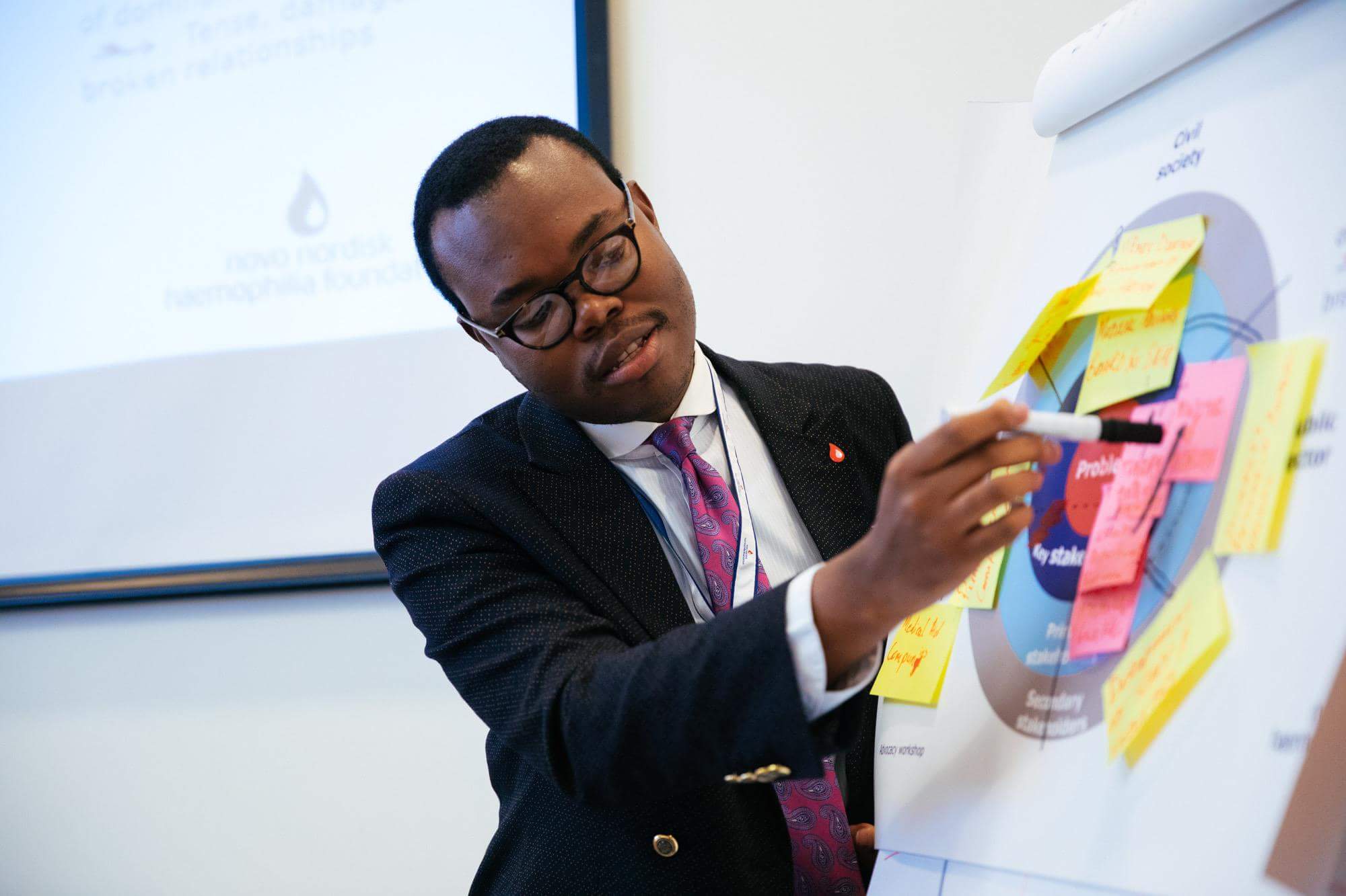
Natural light, honest skin tones, slightly under-cluttered. Slight contrast lift only — no filters, no duotone unless intentionally branded.

Business strategy
Recording studio
Awards ceremony
Brand visual BTS
Lifestyle
Tone
Warm-neutral, naturally lit. Skin tones are honest, never over-cooked.
Composition
Slightly under-cluttered. Subject + breathing room.
Treatment
Slight contrast lift. No grain, no filters, no duotone.
Radius
Image cards round at 18 px — the brand's specific image radius.
iv. Imagery · Illustration

Bold black line. Purple solid fills. The occasional turquoise spark.

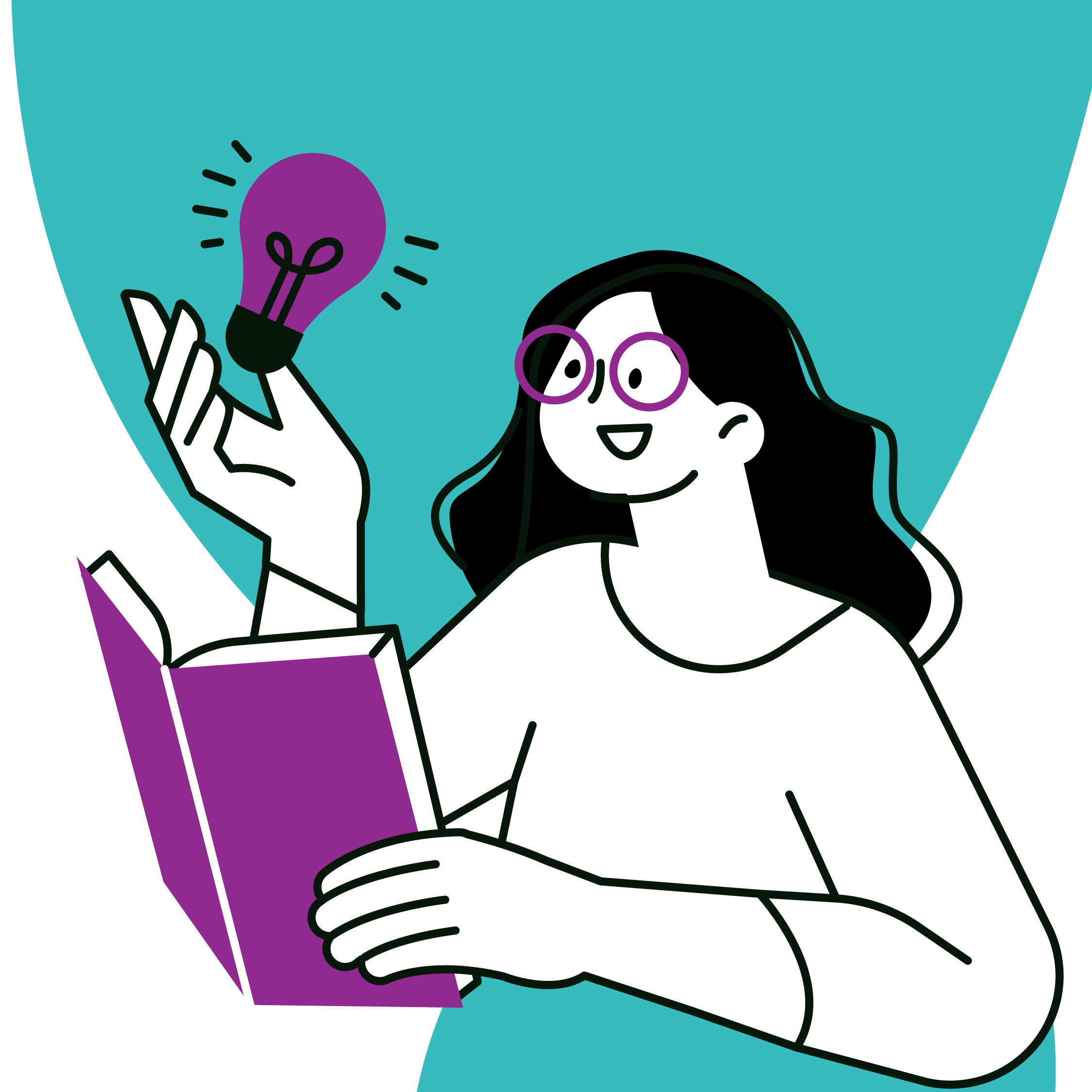
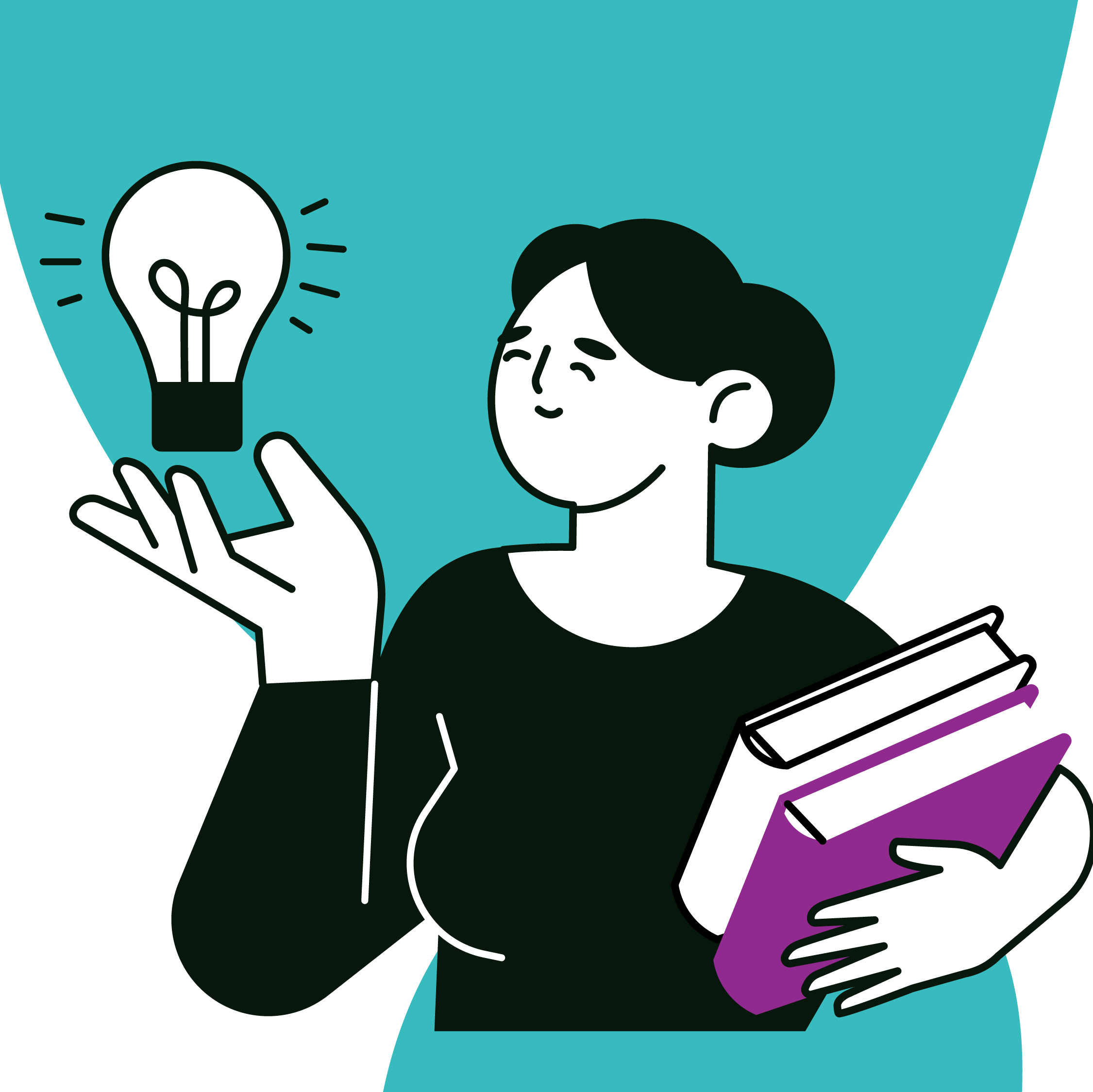
Used for narrative moments — process pages, empty states, feature explainers. Never mixed with photography in the same hero.

PC Illustration
PC Illustration
PC Illustration
PC Illustration
PC Illustration
PC Illustration
PC Illustration
PC Illustration
PC Illustration
PC Illustration
Style
Bold 2 px black stroke. Purple fills. Turquoise for accents. Consistent rounded stroke-linecap throughout.
Where to use
Process diagrams, empty states, feature explainers, proposal covers. Never alongside photography in the same hero panel.
iv. Imagery · Iconography & components

Lucide line icons.
Pill-radius buttons. No surprises.

Iconography · Lucide · 1.5 px stroke · rounded

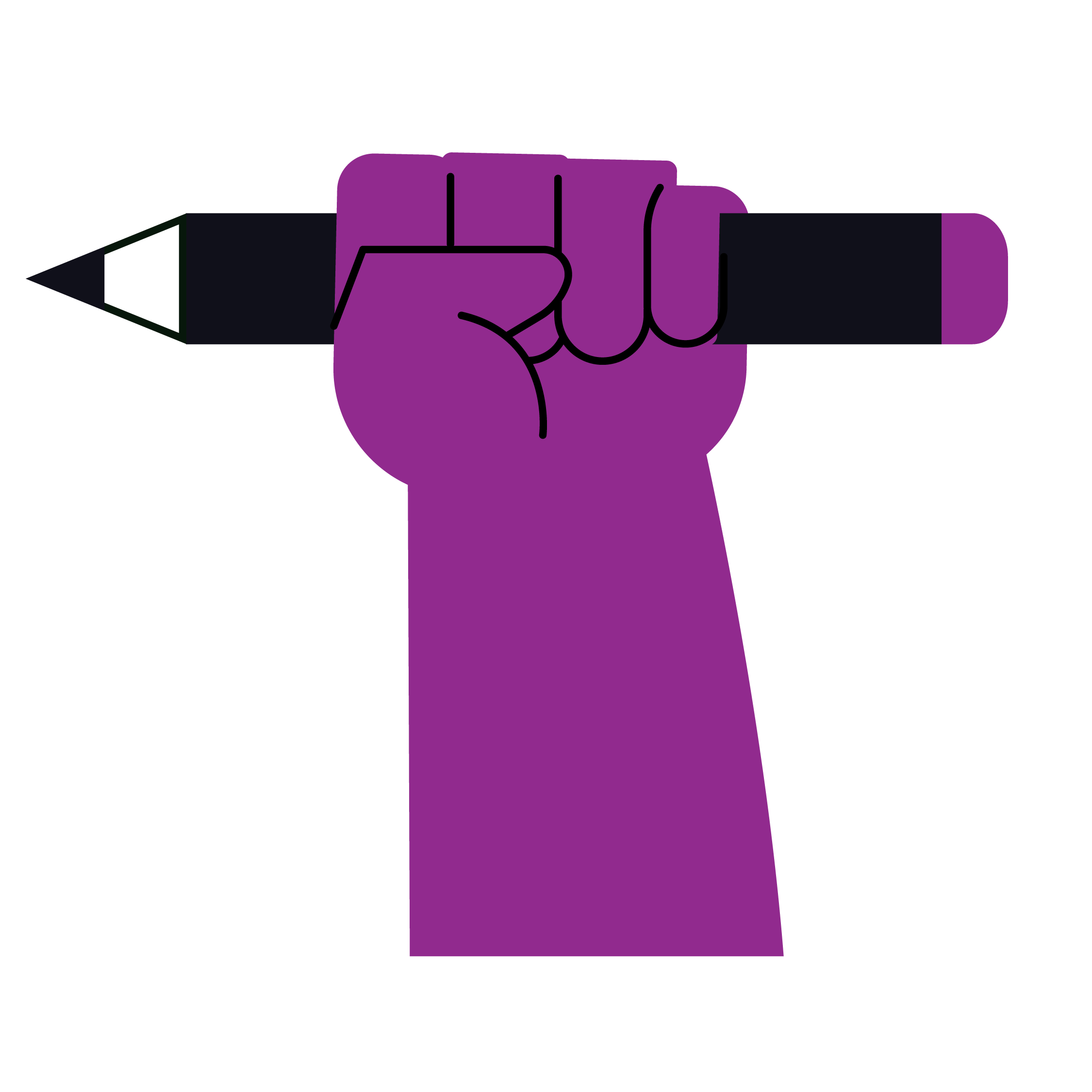
One stroke weight, one colour — currentColor. Brand colour on adjacent eyebrow text only.

Radii & shadows
sm · 6
lg · 16
img · 18
pill · ∞
Buttons · pill radius · Poppins Medium 14

Primary turquoise · Secondary purple · Outline charcoal · Ghost · Text link

Tags & eyebrow labels
Brand identity Strategy Web Audio Featured
Hover & press states
BaseTurquoise · #2A8E92
Hover#237D81 · 200 ms
Press#1B6F72 + 1 px translate-y
iv. Imagery · Layout & motion

12 columns. Generous whitespace.
Short, easy transitions.

12-column grid · 80 px outer · 24 px inner · 1280 max
5 cols
7 cols

Lean toward an asymmetric two-column (5/7 or 4/8) — the image side hangs out of the column grid by 24–48 px to feel art-directed.

Spacing scale · 4 px base
4
8
16
24
32
48
64
80
96
128
Motion · short, easy, never bouncy
120 ms
Hover & press
200 ms
Default transition
320 ms
Page & modal enter/exit
cubic-bezier(.22,1,.36,1)
Standard easing
No-go list
No bounce easing · No scale transforms on hover · No rotation · No spring physics. Colour + shadow + 1–2 px translate only.
Portfolio Creative
A reference, not a rulebook

If anything in here
needs to flex, it can.

Talk to the brand custodians before bending a rule — and propose a change rather than working around the system. Guidelines are most useful when they keep moving.

Custodian
Design · Brand Studio
designer@portfoliocreative.co.za
Studio
info@portfoliostudios.co.za
+27 87 822 1630/1049
Version history
v1.0 — May 2026 · Initial release
we live by these guides
Next review
June 2027 
twelve-month cycle
✓ Copied